
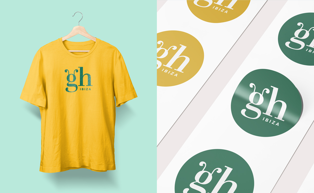
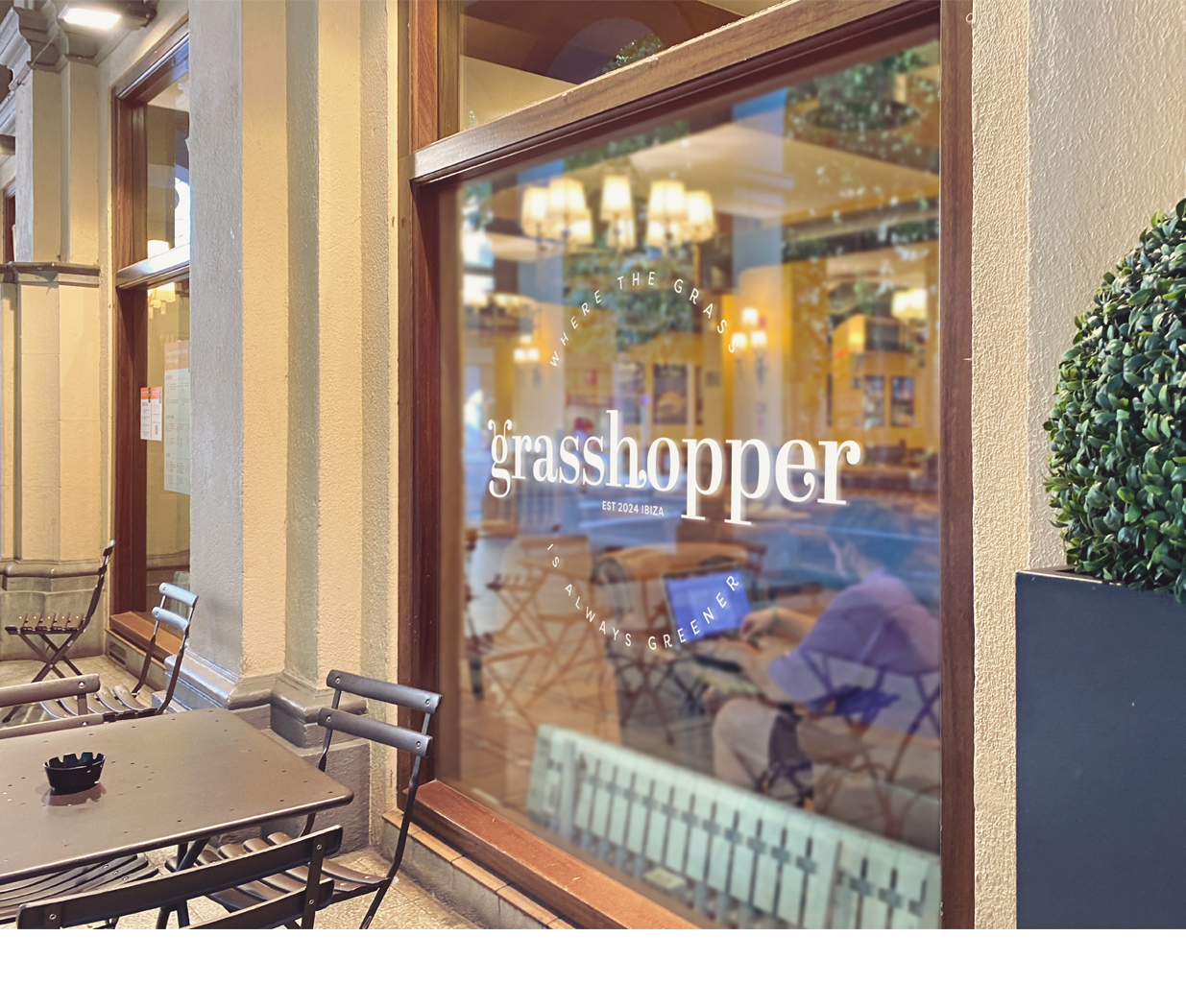
The Solution: Working on a condensed timeline, an identity was designed to mirror the dispensary’s relaxed and approachable personality. A friendly serif font was chosen and modified so that the letter g appeared to have two antennas—just like a grasshopper. Similar embellishments were included off other letterforms, keeping the font relaxed yet springy. A color palette of deep green, pale parchment, and marigold brings to mind images of nature, healing, and growth.

“Thank you SO so much for these beautiful designs. We are so appreciative, so excited, and so impressed!”